
Customizing the editor
TEI (and similar vocabularies) leave many encoding choices open: lists may nest paragraphs or hold text directly; references may point at different authorities; manuscripts, inscriptions and born-digital texts use different tags for similar ideas. JinnTap does not prescribe one tag set. Instead you configure a JSON schema — which elements exist, their attributes, toolbar buttons, shortcuts and authority lookups — so the editor matches your practice.
This page is a short recipe: add an element, style it, put it on the toolbar, and optionally wire an authority connector. The Schema reference documents every property in detail.
1. Add the element to the schema
Point schema at your own JSON file (or edit a copy of
src/tei-schema.json).
Append entries under the top-level schema object. Inline elements use
"type": "inline"; block elements use "type": "block". Declare attributes and
value types so the attribute panel can validate them.
{
  // …
  "schema": {
    // …
    "rs": {
      "type": "inline",
      "attributes": {
        "type": {
          "type": "string",
          "enum": ["event", "person"]
        },
        "corresp": {
          "type": "string"
        }
      }
    }
  }
}
If a loaded document already contains markup that is not in the schema, JinnTap synthesizes a generic entry so the element round-trips instead of being dropped — see Unknown elements. To make it first-class (toolbar, shortcuts, content model), add it here.
Full property list: Element definitions.
2. Style it in CSS
Schema awareness alone does not make the element visible to authors. Each schema
declares a stylesheet via its top-level css
property (built-ins ship
tei-editor-styles.css
and
jats-editor-styles.css).
<jinn-tap> injects that sheet automatically; override or extend the rules in your
host stylesheet.
In the editor, XML elements become HTML custom elements with a format prefix:
rs → tei-rs (or jats-… for JATS). Configured attributes are copied onto the
HTML element, so you can target them with attribute selectors.
tei-rs[type="person"] {
color: #e48500;
}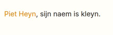 A
A tei-rs[type="person"] span after applying the rule above.
Styling the component chrome
The editor shell (toolbar, breadcrumbs, attribute panel, connector sidebar) is
themed with CSS custom properties on <jinn-tap>. All component tokens use the
--jinn-tap- prefix. Set them in your host stylesheet or on the element:
jinn-tap {
  --jinn-tap-toolbar-bg: #f2eee6;
  --jinn-tap-content-max-width: 48rem;
}
Layout and connector panels
These control where the attribute panel appears and whether authority connector lookups dock beside the editor or open as a slide-over overlay.
| Variable | Default | Purpose |
|---|---|---|
--jinn-tap-content-max-width |
none |
Maximum width of the editor/content area. When set, a connector panel docks in a right column only if the component is wide enough to fit this width plus the connector panel without shrinking the content. Otherwise the panel opens as an overlay; a collapsed summary stays in the bottom status bar until the author clicks Expand. |
--jinn-tap-connector-panel-width |
20rem |
Width reserved for a docked connector panel (and for the empty column that prevents the editor from shifting when the panel opens). |
Normal (non-connector) attributes always use the bottom status bar, even when a content max-width is set.
Toolbar and navigation
| Variable | Default | Purpose |
|---|---|---|
--jinn-tap-toolbar-bg |
#f4f4f4 |
Toolbar and breadcrumb background |
--jinn-tap-toolbar-fg |
#1a1a1a |
Toolbar icon and label colour |
--jinn-tap-toolbar-separator |
rgba(0,0,0,0.14) |
Dividers between toolbar groups and panel borders |
--jinn-tap-toolbar-hover |
rgba(0,0,0,0.06) |
Hover background on toolbar controls |
--jinn-tap-toolbar-active |
rgba(0,0,0,0.1) |
Active/pressed toolbar state |
--jinn-tap-toolbar-mark |
rgba(0,0,0,0.12) |
Background for active mark buttons |
--jinn-tap-toolbar-mark-fg |
#1a1a1a |
Text/icon on active mark buttons |
--jinn-tap-toolbar-btn-size |
2rem |
Toolbar button height and width |
--jinn-tap-toolbar-dropdown-bg |
#fff |
Dropdown menu background |
--jinn-tap-toolbar-dropdown-border |
rgba(0,0,0,0.16) |
Dropdown menu border |
--jinn-tap-toolbar-dropdown-shadow |
0 2px 8px rgba(0,0,0,0.12) |
Dropdown menu shadow |
--jinn-tap-toolbar-focus-ring |
rgba(0,90,180,0.45) |
Focus outline on toolbar controls |
--jinn-tap-chrome-inline |
1rem |
Horizontal padding for toolbar and breadcrumb (unset in the library stylesheet so hosts can set it without specificity fights) |
When the toolbar is hosted outside the component (toolbar="…"), the same tokens
apply on the .jinn-tap-toolbar wrapper.
Surfaces and miscellany
| Variable | Default | Purpose |
|---|---|---|
--jinn-tap-background-color |
white |
Editor shell background (toolbar fallback, attribute panel, aside) |
--jinn-tap-authority-select-bg |
#1a1816 |
“Select” button background in authority lookup results |
--jinn-tap-authority-select-fg |
#fffefc |
“Select” button text colour |
--jinn-tap-authority-select-bg-hover |
#55504a |
“Select” button hover background |
--jinn-tap-overlay-color |
rgb(255,123,0) |
Outline on inline overlay elements (e.g. pending links) |
--jinn-tap-unknown-font-family |
ui-monospace, … |
Font for synthesized unknown elements |
--jinn-tap-unknown-font-size |
0.7em |
Font size for unknown elements |
--jinn-tap-unknown-color |
#b36b00 |
Colour for unknown elements |
3. Put it on the toolbar
Elements appear on the toolbar either as a direct button or inside a dropdown
select. Direct buttons are highly visible; selects
save space for less frequent markup.
Direct button
"rs": {
  "type": "inline",
  "attributes": { /* … */ },
  "toolbar": {
    "Person": {
      "attributes": { "type": "person" },
      "label": "<i class='bi bi-person-fill'></i>",
      "order": 2
    }
  }
}
The button key ("Person") is the tooltip. label is HTML — the demos use
Bootstrap Icons. Lower order values sort
further left.
Button inside a select
Declare the group once under top-level selects, then set "select": "…" on the
button:
{
  "selects": {
    "Textcritical": {
      "label": "<i class='bi bi-highlighter'></i>"
    }
  },
  "schema": {
    "rs": {
      "type": "inline",
      "attributes": { /* … */ },
      "toolbar": {
        "Person": {
          "select": "Textcritical",
          "order": 2,
          "attributes": { "type": "person" },
          "label": "<i class='bi bi-person-fill'></i>"
        }
      }
    }
  }
}Details: Toolbar & selects.
4. Wire an authority connector (optional)
Some attributes should resolve against an external register (GND, GeoNames,
Airtable, …). Add a connector on the attribute definition:
"rs": {
"type": "inline",
"attributes": {
"corresp": {
"type": "string",
"connector": {
"name": "GND",
"type": "person",
"prefix": "gnd"
}
},
"type": {
"type": "string",
"enum": ["event", "person"]
}
},
"toolbar": { /* … */ }
}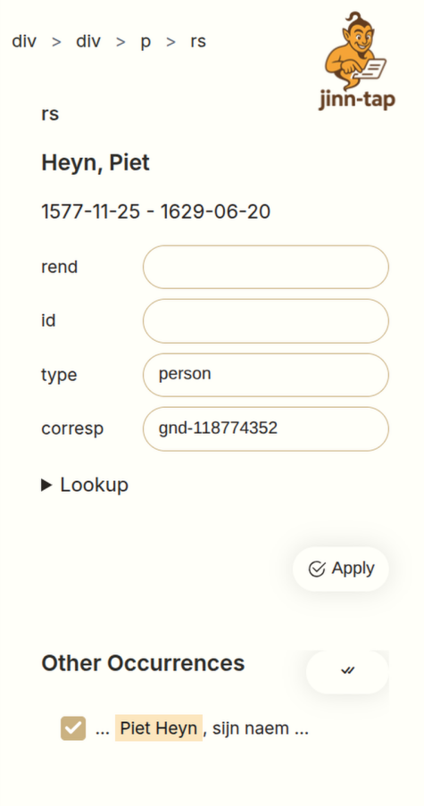 Authority search in the attribute panel after selecting the annotated span.
Connectors are rendered by @teipublisher/pb-components (a peer dependency). Load
its bundle to enable the lookup UI — see
Installation → authority lookups. Without
it, the attribute remains a plain text field.
Full connector options: Attributes & connectors.
Next steps
- Schema overview — top-level file shape and built-in catalogs
- Keyboard & input rules — shortcuts and typing rules
- Embedding — collaboration, slots, and host-app layout
- Adding a format — dialects beyond TEI/JATS