
Writing in the editor
Try the behaviours below in the live editor (TEI XML mode).
The editing model
The default starting point is always a paragraph. Use the toolbar (or shortcuts) to turn it into a heading, list, or other block.
Note that the editor is strictly following the underlying document model based on the XML format you're editing. This means not all elements are allowed at any position. In a TEI text, a heading may only appear at the start of a division, not after a paragraph.
Blocks, lists, and empty markers
- Pressing Backspace or Delete inside an otherwise empty block removes that block.
- In a list:
- Tab nests a list under the current item.
- Shift-Tab moves the item one level up; at the top level it becomes a normal paragraph.
- TEI lists may start with a heading: place the cursor in the first item and choose Head from the toolbar.
- Empty elements such as
lb,pb, orgapappear as coloured markers. You can insert, delete, or edit their attributes, but not type text inside them.
Inline markup
Select text and use a toolbar button (or shortcut) to apply inline markup (hi,
ref, persName etc. in TEI, bold, italic, named-content in JATS). Those
controls are toggles: press again to remove the mark.
 The Bold and Italic buttons — most inline marks work the same way.
See Keyboard shortcuts for the TEI defaults.
Attributes and breadcrumbs
As you move through the document, you'll see the attributes associated with the current node in the attribute panel. Its position can differ: by default the panel will stay at the bottom and may expand to the right for some types of nodes. If there's more space available, the attribute panel may also appear fixed in a sidebar or similar. This is up to the web developer to decide.
You may change any of the attribute values and click apply to write them to the document.
TEI example: mark some text bold (hi), then place the cursor inside it,
switch the dropdown to underline (rend="u"), and apply.
 Change a value, then click Apply to write it to the document.
In many cases you may want to change attributes or apply actions on nodes which are ancestors of the current node.
The breadcrumb panel at the top below the toolbar shows you the path to the element the cursor is currently in. Clicking on an ancestor node selects and highlights it with an outline border. You can then change its attributes or apply actions like Move up, e.g. to lift a subsection into its parent.
 Click any crumb to select that ancestor node.
Divisions
To create a new division, use the corresponding toolbar button (or type >> at the start of a block — see
Shortcodes). The new division always becomes a
child of the division you are positioned in. The vertical color bars to the right of the editor content show you the nesting of divisions.
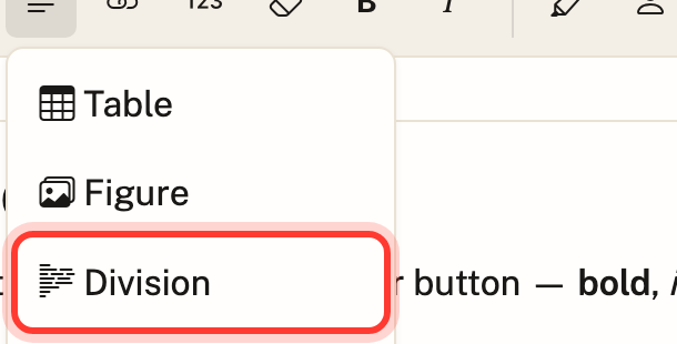 Block-level elements like Division, Figure, and Table live in this dropdown.
To move a division one level up:
- Place the cursor inside it.
- Select the division via the breadcrumb bar.
- Click Move up in the toolbar.
The same procedure works for other blocks. Moving a block up when siblings follow it in the same parent splits the enclosing division.
Footnotes
Footnotes are standoff annotations, not inline note text in the paragraph. Each note is two pieces:
- an anchor in the text (the reference), and
- a note block in a standoff list (
listAnnotationin TEI).
The note links to the anchor via target (pointing at the anchor’s xml:id).
Click an anchor to select it. Hold Ctrl (or ⌘ on Mac) and click to jump to the note text.
 Inserts an anchor at the cursor and a matching note.
 The small superscript number is the anchor — Ctrl/Cmd-click it to jump to its note.
Configure behaviour on the web component with notes:
| Mode | Attribute | Behaviour |
|---|---|---|
| Connected | notes="connected" |
Notes cannot exist without an anchor; deleting the anchor deletes the note. |
| Disconnected (default) | omit or unset | Deleting an anchor leaves the note (shown as orphaned). Inserting a new anchor automatically re-links the first orphaned note (TEI: sets note/@target; JATS: sets xref/@rid). |
Disconnected mode is especially useful for OCR-sourced text where notes were recognised but anchors were not.
Semantic annotations
JinnTap has extended support for semantic annotation, drawing on external registers to identify entities. In simpler words: the entity will be linked to an external authority database, uniquely identifying this particular person, place, organisation or term.
This is a feature provided by TEI Publisher and uses the same library of database connectors, currently including GND, GeoNames and others.
For people, places, organisations, and terms, select the span and use the matching
toolbar button (e.g. Person). The attribute panel can show a connector search
(GND, GeoNames, …) when
@teipublisher/pb-components is loaded. When there is not
enough room to dock the panel beside the editor content (see
CSS variables → layout), it opens
as a slide-over with a summary in the bottom bar; wider layouts dock it in a fixed
column on the right without shifting the text.
Pick an entry with the link control to fill the key (or similar) attribute. Selecting
from the registry applies that attribute automatically — you usually do not need
Apply for that change alone. Extra entity info may appear at the top of the panel.
 Select a span of text first, then choose the matching entity type.
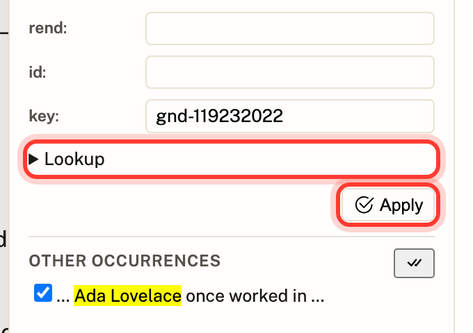 Use Lookup to search the connected authority database.
Shortcodes
Type these at the start of a paragraph (input rules from the schema):
| Type… | Result |
|---|---|
## |
Turn the paragraph into a heading |
>> |
Wrap the current block in a division |
* then space |
Unordered list |
1. then space |
Numbered list |
-- / --- |
En dash (–) / em dash (—) |
More detail: Keyboard & input rules.
Figures and tables
Figure and Table both live in the Block elements dropdown (same place as Division).
Inserting a figure
Choose Figure to insert a container with a placeholder image and a short description you can edit in place:
| Format | Markup inserted |
|---|---|
| TEI | figure → graphic + head |
| JATS | fig → graphic + caption (with a p) |
The schema also allows TEI figDesc inside figure; the toolbar command uses
head as the default caption. A lone Graphic action is available in the same
dropdown if you need an image without the surrounding figure wrapper.
Both live in the same dropdown as Division and the other block-level elements.
Choosing an image
Click the image (or select graphic in the breadcrumb) to open the attribute
panel. The image URL is stored on url (TEI) or xlink:href (JATS).
In these documentation embeds an asset store is attached, so the panel shows an image picker alongside the URL field:
- type a relative path (
myimage.png) or an absolutehttp(s):URL in the field, then press Enter or Apply, - or upload via browse / drag-and-drop and pick a thumbnail (same filename overwrites),
- delete a stored image from the picker (with confirm).
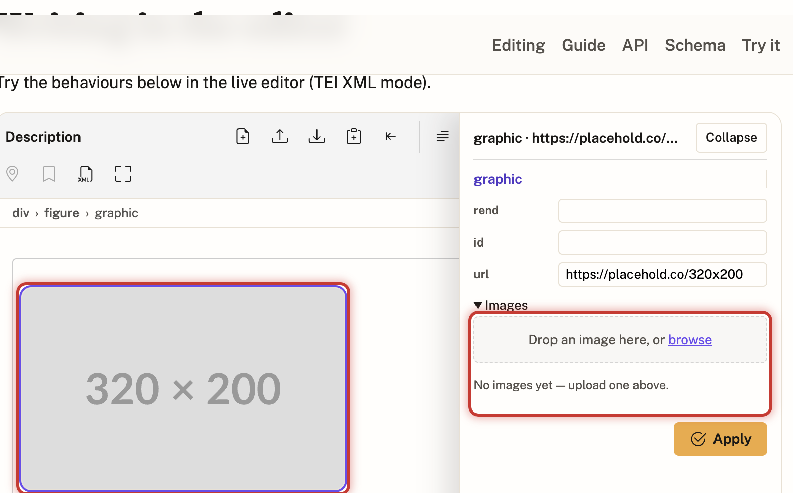 Select the graphic, then type a URL or upload/pick an image in the attribute panel.
Host apps without an asset store only get the manual URL field — see
Assets for wiring IndexedDbAssetStore or a
publisher HTTP store.
When you download a document that references local images, the demo offers a ZIP (XML plus the image files) or XML only. Details: Exporting with images.
Tables
Table inserts a small starter grid (two rows, two cells). Click inside a cell to edit; use the table bubble menu for row/column actions when the cursor is in the table.
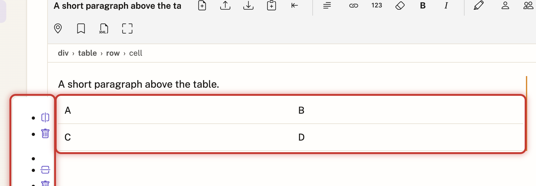 With the cursor in a cell, the floating menu adds or removes rows and columns.
Source view
The Show/Hide Code toolbar control toggles a read-only XML view of the full document so you can check what will be saved. Editing still happens in the rich-text pane.
 Toggles a read-only XML view of the document.
Next steps
- Keyboard shortcuts
- Usage — seeding and reading content from an app
- Customizing the editor — schema, CSS, toolbar, connectors
- Schema reference — element catalogs and property reference
- Embedding — drop
<jinn-tap>into your application